1. classnames 모듈 사용
** /component/button.jsx
import classNames from 'classnames';
import React from 'react';
import './button.scss';

/*
    HTML에서 CSS class 적용
    <div class="button size">2가지 class 적용</div>
*/
function Button({children, size, color, outline}) {
    // return <button className={["Button", size, color].join(' ')}>{children}</button>;
    // classnames 사용시
    return <button className={classNames("Button", size, color, {outline})}>{children}</button>;
}

Button.defaultProps = {
    size: 'medium',
    color: 'blue'
}

export default Button;
** /component/button.scss
$blue: #228be6;
$gray: #495057;
$pink: #f06595;

@mixin button-color($color) {
    background-color: $color;
    &:hover {
        background-color: lighten($color, 10%);
    }
    &:active {
        background-color: darken($color, 10%);
    }
    &.outline {
        color: $color;
        background: none;
        border: 1px solid $color;
        &:hover {
            background-color: $color;
            color: white;
        }
    }
}

.Button {
    display: inline-flex;
    color: white;
    font-weight: bold;
    outline: none;
    border-radius: 4px;
    border: none;
    cursor: pointer;

    // 1. 첫번째 size 실습
    // height: 2.3rem;
    // padding-top: 0.5rem;
    // padding-left: 1rem;
    // padding-right: 1rem;
    // font-size: 1rem;

    // 2. 두번째 size 실습
    &.large {
        height: 3rem;
        padding-top: 0.6rem;
        padding-left: 1rem;
        padding-right: 1rem;
        font-size: 1.25rem;
    }

    &.medium {
        height: 2.25rem;
        padding-top: 0.5rem;
        padding-left: 1rem;
        padding-right: 1rem;
        font-size: 1rem;
    }

    &.small {
        height: 1.7rem;
        padding-top: 0.3rem;
        padding-left: 1rem;
        padding-right: 1rem;
        font-size: 0.85rem;
    }

    // 1. 첫번째 color 실습
    // background-color: $blue;                    // $blue 변수값을 저장
    // &:hover {
    //     background-color: lighten($blue, 10%);  // 색상을 10% 밝게
    // }
    // &:active {
    //     background-color: darken($blue, 10%);   // 색상을 10% 어둡게
    // }

    // 2. 두번째 color 실습
    // &.blue {
    //     background-color: $blue;
    //     &:hover {
    //         background-color: lighten($blue, 10%);
    //     }
    //     &:active {
    //         background-color: darken($blue, 10%);
    //     }
    // }
    // &.gray {
    //     background-color: $gray;
    //     &:hover {
    //         background-color: lighten($gray, 10%);
    //     }
    //     &:active {
    //         background-color: darken($gray, 10%);
    //     }
    // }
    // &.pink {
    //     background-color: $pink;
    //     &:hover {
    //         background-color: lighten($pink, 10%);
    //     }
    //     &:active {
    //         background-color: darken($pink, 10%);
    //     }
    // }

    // 3. 세번째 color 실습
    &.blue {
        @include button-color($blue);
    }
    &.gray {
        @include button-color($gray);
    }
    &.pink {
        @include button-color($pink);
    }

    & + &  {
        margin-left: 1rem;
    }
}
** app.jsx
import React from 'react';
import './app.scss';
import Button from './component/button'
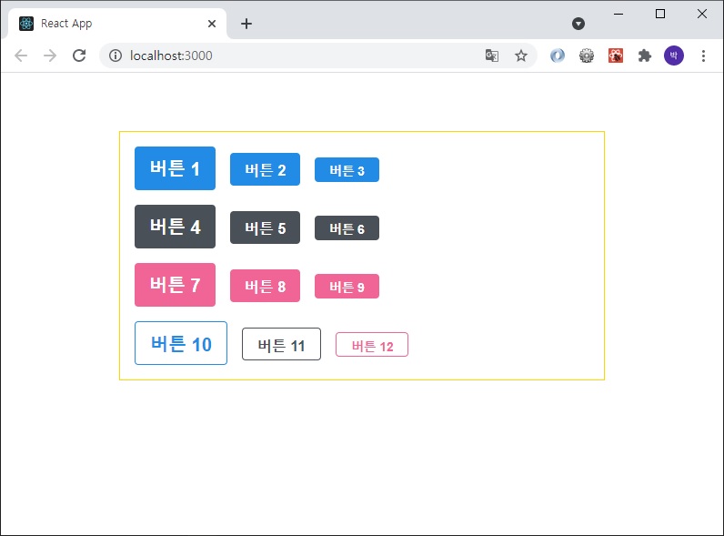
function App() {
return (
<div className="App">
<div className="height">
<Button size="large">버튼 1</Button>
<Button>버튼 2</Button>
<Button size="small">버튼 3</Button>
</div>
<div className="height">
<Button size="large" color="gray">버튼 4</Button>
<Button color="gray">버튼 5</Button>
<Button size="small" color="gray">버튼 6</Button>
</div>
<div className="height">
<Button size="large" color="pink">버튼 7</Button>
<Button color="pink">버튼 8</Button>
<Button size="small" color="pink">버튼 9</Button>
</div>
<div className="height">
<Button size="large" color="blue" outline>버튼 10</Button>
<Button color="gray" outline>버튼 11</Button>
<Button size="small" color="pink" outline>버튼 12</Button>
</div>
</div>
);
}
export default App;
** /component/button.jsx
import classNames from 'classnames';
import React from 'react';
import './button.scss';

/*
    HTML에서 CSS class 적용
    <div class="button size">2가지 class 적용</div>
*/
function Button({children, size, color, outline, fullWidth}) {
    // return <button className={["Button", size, color].join(' ')}>{children}</button>;
    // classnames 사용시
    return <button className={classNames("Button", size, color, {outline, fullWidth})}>{children}</button>;
}

Button.defaultProps = {
    size: 'medium',
    color: 'blue'
}

export default Button;
** /component/button.scss
$blue: #228be6;
$gray: #495057;
$pink: #f06595;

@mixin button-color($color) {
    background-color: $color;
    &:hover {
        background-color: lighten($color, 10%);
    }
    &:active {
        background-color: darken($color, 10%);
    }
    &.outline {
        color: $color;
        background: none;
        border: 1px solid $color;
        &:hover {
            background-color: $color;
            color: white;
        }
    }
}

.Button {
    display: inline-flex;
    color: white;
    font-weight: bold;
    outline: none;
    border-radius: 4px;
    border: none;
    cursor: pointer;

    // 1. 첫번째 size 실습
    // height: 2.3rem;
    // padding-top: 0.5rem;
    // padding-left: 1rem;
    // padding-right: 1rem;
    // font-size: 1rem;

    // 2. 두번째 size 실습
    &.large {
        height: 3rem;
        padding-top: 0.6rem;
        padding-left: 1rem;
        padding-right: 1rem;
        font-size: 1.25rem;
    }

    &.medium {
        height: 2.25rem;
        padding-top: 0.5rem;
        padding-left: 1rem;
        padding-right: 1rem;
        font-size: 1rem;
    }

    &.small {
        height: 1.7rem;
        padding-top: 0.3rem;
        padding-left: 1rem;
        padding-right: 1rem;
        font-size: 0.85rem;
    }

    // 1. 첫번째 color 실습
    // background-color: $blue;                    // $blue 변수값을 저장
    // &:hover {
    //     background-color: lighten($blue, 10%);  // 색상을 10% 밝게
    // }
    // &:active {
    //     background-color: darken($blue, 10%);   // 색상을 10% 어둡게
    // }

    // 2. 두번째 color 실습
    // &.blue {
    //     background-color: $blue;
    //     &:hover {
    //         background-color: lighten($blue, 10%);
    //     }
    //     &:active {
    //         background-color: darken($blue, 10%);
    //     }
    // }
    // &.gray {
    //     background-color: $gray;
    //     &:hover {
    //         background-color: lighten($gray, 10%);
    //     }
    //     &:active {
    //         background-color: darken($gray, 10%);
    //     }
    // }
    // &.pink {
    //     background-color: $pink;
    //     &:hover {
    //         background-color: lighten($pink, 10%);
    //     }
    //     &:active {
    //         background-color: darken($pink, 10%);
    //     }
    // }

    // 3. 세번째 color 실습
    &.blue {
        @include button-color($blue);
    }
    &.gray {
        @include button-color($gray);
    }
    &.pink {
        @include button-color($pink);
    }

    & + &  {
        margin-left: 1rem;
    }

    &.fullWidth {
        width: 100%;
        justify-content: center;
        & + & {
            margin-left: 0;
            margin-top: 1rem;
        }
    }
}
** app.jsx
import React from 'react';
import './app.scss';
import Button from './component/button'
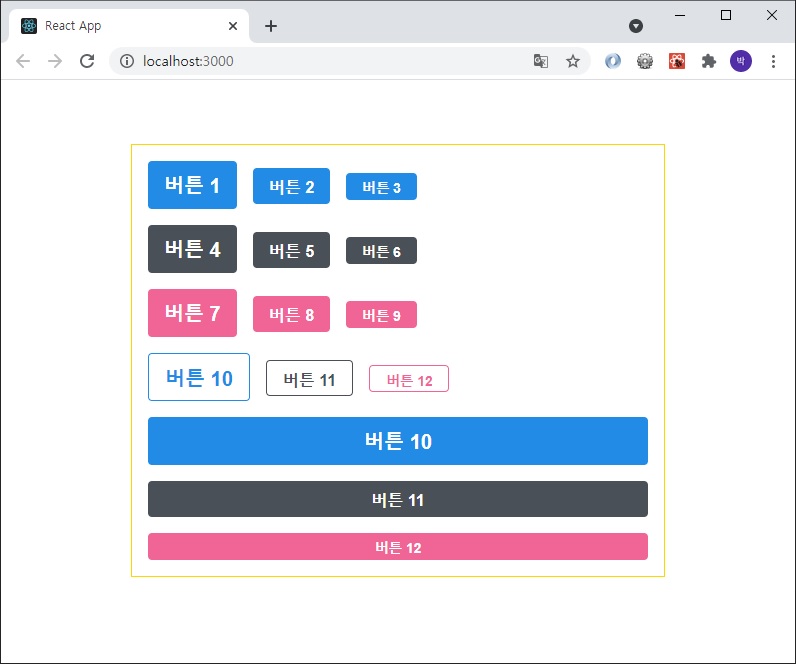
function App() {
return (
<div className="App">
<div className="height">
<Button size="large">버튼 1</Button>
<Button>버튼 2</Button>
<Button size="small">버튼 3</Button>
</div>
<div className="height">
<Button size="large" color="gray">버튼 4</Button>
<Button color="gray">버튼 5</Button>
<Button size="small" color="gray">버튼 6</Button>
</div>
<div className="height">
<Button size="large" color="pink">버튼 7</Button>
<Button color="pink">버튼 8</Button>
<Button size="small" color="pink">버튼 9</Button>
</div>
<div className="height">
<Button size="large" color="blue" outline>버튼 10</Button>
<Button color="gray" outline>버튼 11</Button>
<Button size="small" color="pink" outline>버튼 12</Button>
</div>
<div className="height">
<Button size="large" color="blue" fullWidth>버튼 10</Button>
<Button color="gray" fullWidth>버튼 11</Button>
<Button size="small" color="pink" fullWidth>버튼 12</Button>
</div>
</div>
);
}
export default App;
** /component/button.jsx
import classNames from 'classnames';
import React from 'react';
import './button.scss';

/*
    HTML에서 CSS class 적용
    <div class="button size">2가지 class 적용</div>
*/
function Button({children, size, color, outline, fullWidth, ...rest}) {
    // return <button className={["Button", size, color].join(' ')}>{children}</button>;
    // classnames 사용시
    return <button className={classNames("Button", size, color, {outline, fullWidth})} {...rest}>{children}</button>;
}

Button.defaultProps = {
    size: 'medium',
    color: 'blue'
}

export default Button;
** app.jsx
import React from 'react';
import './app.scss';
import Button from './component/button'
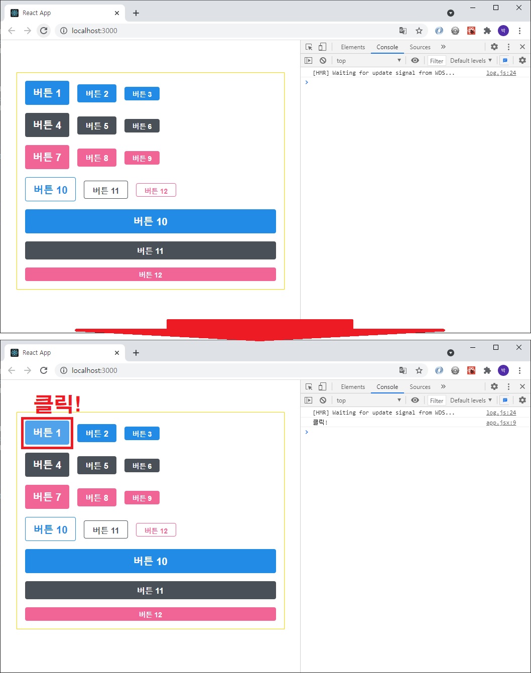
function App() {
return (
<div className="App">
<div className="height">
<Button size="large" onClick={() => console.log('클릭!')}>버튼 1</Button>
<Button>버튼 2</Button>
<Button size="small">버튼 3</Button>
</div>
<div className="height">
<Button size="large" color="gray">버튼 4</Button>
<Button color="gray">버튼 5</Button>
<Button size="small" color="gray">버튼 6</Button>
</div>
<div className="height">
<Button size="large" color="pink">버튼 7</Button>
<Button color="pink">버튼 8</Button>
<Button size="small" color="pink">버튼 9</Button>
</div>
<div className="height">
<Button size="large" color="blue" outline>버튼 10</Button>
<Button color="gray" outline>버튼 11</Button>
<Button size="small" color="pink" outline>버튼 12</Button>
</div>
<div className="height">
<Button size="large" color="blue" fullWidth>버튼 10</Button>
<Button color="gray" fullWidth>버튼 11</Button>
<Button size="small" color="pink" fullWidth>버튼 12</Button>
</div>
</div>
);
}
export default App;
2. CSS Module
: 리액트 프로젝트에서 컴포넌트를 스타일링할 때,
CSS Module 기술을 사용하면 CSS 클래스가 중첩되는 것을 완벽히 방지할 수 있다.
"CSS 파일 확장자를 .module.css로 해야 한다"
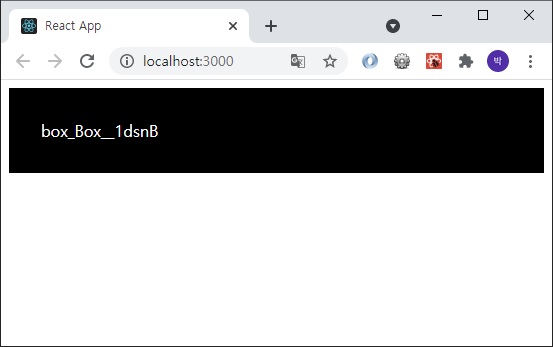
** box.module.css
.Box {
    background-color: black;
    color: white;
    padding: 2rem;
}
** box.jsx
import React from 'react';
import styles from './box.module.css';

function Box() {
    return <div className={styles.Box}>{styles.Box}</div>
}

export default Box;
** index.js
import React from 'react';
import ReactDOM from 'react-dom';
import App from './app';

ReactDOM.render(
  <React.StrictMode>
    <App />
  </React.StrictMode>,
  document.getElementById('root')
);
** app.jsx
import React, { useState } from 'react';
import Box from './component/box'

function App() {
  return (
    <>
    <Box/>
    </>
  );
}

export default App;
** /component/checkbox.jsx
import React from 'react';

function Checkbox({children, checked, ...rest}) {
    return (
        <div>
            <label>
                <input type="checkbox" checked={checked} {...rest}/>
                <div>{checked ? '체크됨' : '체크 안됨'}</div>
            </label>
            <span>{children}</span>
        </div>
    );
}

export default Checkbox;
** app.jsx
import React, { useState } from 'react';
// import Box from './component/box'
import Checkbox from './component/checkbox';

function App() {

  const [check, setCheck] = useState(false);
  const onChange = e => {
    setCheck(e.target.checked);
  };

  // return (
  //   <>
  //   <Box/>
  //   </>
  // );
  return (
    <div>
      <Checkbox onChange={onChange} checked={check}>
        약관에 모두 동의
      </Checkbox>
      <p>
        <b>check : </b>{check? 'true' : 'false'}
      </p>
    </div>
  );
}

export default App;

3. react-icons
yarn add react-icons
[참고사이트] https://react-icons.github.io/react-icons/#/
** checkbox.module.css
.checkbox {
    display: flex;
    align-items: center;
}

.checkbox label {
    cursor: pointer;
}

.checkbox input {
    width: 0;
    height: 0;
    position: absolute;
    opacity: 0;
}

.checkbox span {
    font-size: 1.2rem;
    font-weight: bold;
}

.icon {
    display: flex;
    align-items: center;
    font-size: 2rem;
    margin-right: 0.3rem;
    color: #adb3db;
}

.checked {
    color: #339af0;
}
** checkbox.jsx
import React from 'react';
import {MdCheckBox, MdCheckBoxOutlineBlank} from 'react-icons/md';
import styles from './checkbox.module.css';

function Checkbox({children, checked, ...rest}) {
    return (
        <div className={styles.checkbox}>
            <label>
                <input type="checkbox" checked={checked} {...rest}/>
                <div className={styles.icon}>{checked ? (<MdCheckBox className={styles.checked}/>) : (<MdCheckBoxOutlineBlank/>)}</div>
            </label>
            <span>{children}</span>
        </div>
    );
}

export default Checkbox;

4. Template Literal, reduce()
** taggedTemplate.js
const name = '김사과';
const message1 = `안녕, ${name}`;

console.log(message1);


// Template Literal을 사용할 때, ${} 안에 객체를 넣는다면?
const obj = {num:1};
const message2 = `${obj}`

console.log(message2);


// Template Literal을 사용할 때, ${} 안에 함수를 넣는다면?
const fn = () => true
const message3 = `${fn}`

console.log(message3);


const red = '빨간색';
const blue = '파란색';

function favoriteColors(texts, ...values) {
    // console.log(texts);
    // console.log(values);
    return texts.reduce((result, text, i) => `${result}${text}${values[i] ? `<b>${values[i]}</b>` : ''}`, '');
}

console.log(favoriteColors`제가 좋아하는 색은 ${red}과 ${blue}입니다.` );
** reduce.js
const number = [1, 2, 3, 4, 5, 6, 7, 8, 9, 10];

const val = 0;

const total = number.reduce((val1, val2, idx, arr) => {
    console.log(`val1 : ${val1}, val2 : ${val2}`);
    return val1 + val2;
}, val);

console.log(total);


/*
    reduce
    val1 : reduce() 함수의 두번째 파라미터 val 값이 넘어온다.
    val2 : number의 첫번째 데이터 1이 넘어온다.
    idx : reduce() 함수의 두번째 파라미터인 val를 사용했는지 안했는지에 따라 값이 달라진다.
          val을 사용했다면 0부터, 사용하지 않았다면 1부터 시작한다.
    arr : reduce() 함수가 호출된 배열, number가 리턴
*/
5. styled-components
: JS 안에 CSS를 작성하는 라이브러리이다.
"yarn add styled-components"
** app.jsx
import React, { useState } from 'react';
// import Box from './component/box'
// import Checkbox from './component/checkbox';
import styled from 'styled-components';
const Circle = styled.div`
width: 5rem;
height: 5rem;
background: black;
border-radius: 50%
`;
function App() {
// const [check, setCheck] = useState(false);
// const onChange = e => {
// setCheck(e.target.checked);
// };
// // return (
// // <>
// // <Box/>
// // </>
// // );
// return (
// <div>
// <Checkbox onChange={onChange} checked={check}>
// 약관에 모두 동의
// </Checkbox>
// <p>
// <b>check : </b>{check? 'true' : 'false'}
// </p>
// </div>
// );
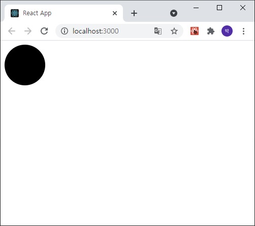
return <Circle/>
}
export default App;
** app.jsx
import React, { useState } from 'react';
// import Box from './component/box'
// import Checkbox from './component/checkbox';
import styled, {css} from 'styled-components';
const Circle = styled.div`
width: 5rem;
height: 5rem;
background: ${props => props.color || 'black'};
border-radius: 50%;
${props =>
props.big && css`
width: 10rem;
height: 10rem;
`}
`;
function App() {
// const [check, setCheck] = useState(false);
// const onChange = e => {
// setCheck(e.target.checked);
// };
// // return (
// // <>
// // <Box/>
// // </>
// // );
// return (
// <div>
// <Checkbox onChange={onChange} checked={check}>
// 약관에 모두 동의
// </Checkbox>
// <p>
// <b>check : </b>{check? 'true' : 'false'}
// </p>
// </div>
// );
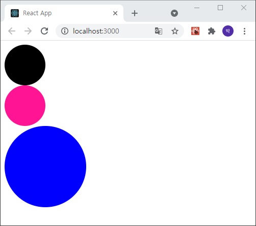
return (
<>
<Circle/>
<Circle color="deeppink"/>
<Circle color="blue" big/>
</>
);
}
export default App;
6. 할일 메모장 만들기(디자인 완료, 다음 수업시간에 데이터 상태 관리부분 마저할 예정)
① styled-components 사용
② Context API를 사용한 전역 상태 관리
③ 배열 상태 다루기
** 컴포넌트 만들기
1) TodoTemplate
: 할일의 레이아웃을 설정하는 컴포넌트
2) TodoHead
: 오늘의 날짜, 요일을 보여주고 해야할 일이 몇 개 남았는지 보여줌
3) ToDoList
: 할일에 대한 정보가 들어 있는 todos 배열을 내장함수 map을 사용하여 여러개 todoitem 컴포넌트를 렌더링
4) TodoItem
: 각 할일에 대한 정보를 렌더링해주는 컴포넌트
완료 여부를 toggle 할 수 있다
할일이 완료되었을때 좌측에 체크가 나타나고 텍스트의 색상을 연하게 만든다
마우스를 올리면 휴지통 아이콘이 나타나고 휴지통을 누르면 삭제된다
5) TodoCreate
: 새로운 할일을 등록할 수 있게 해준다
하단부에 초록색 원 버튼을 렌더링해주고 클릭하면 할일을 입력할 수 있는 폼이 나타난다
버튼을 다시 누르면 폼이 사라진다
** app.jsx
import React from 'react';
import {createGlobalStyle} from 'styled-components';
import TodoTemplate from './components/todoTemplate';
import TodoHead from './components/todoHead';
import TodoList from './components/todoList';
import TodoCreate from './components/todoCreate';

const GlobalStyle = createGlobalStyle`
  body {
    background-color: #e9ecef;
  }
`

function App() {
  return (
    <>
      <GlobalStyle/>
      <TodoTemplate>
        <TodoHead/>
        <TodoList/>
        <TodoCreate/>
      </TodoTemplate>
    </>
  );
}

export default App;
** index.js
import React from 'react';
import ReactDOM from 'react-dom';
import App from './app';

ReactDOM.render(
  <React.StrictMode>
    <App />
  </React.StrictMode>,
  document.getElementById('root')
);
** /components/todoTemplate.jsx
import React from 'react';
import styled from 'styled-components';

const TodoTemplateBlock = styled.div`
    width: 512px;
    height: 768px;

    position: relative;
    background-color: white;
    border-radius: 16px;
    box-shadow: 0 0 8px 0 raba(0, 0, 0, 0.01);

    margin: 0 auto;
    margin-top: 96px;
    margin-botton: 32px;
    display: flex;
    flex-direction: column;
`;

function TodoTemplate({children}) {
    return <TodoTemplateBlock>{children}</TodoTemplateBlock>;
}

export default TodoTemplate;
** /components/toDoHead.jsx
import React from 'react';
import styled from 'styled-components';

const TodoHeadBlock = styled.div`
    padding: 48px 32px 24px 32px;
    border-botton: 1px solid #e9ecef;

    h1 {
        magin: 0;
        font-size: 36px;
        color: #343a40;
    }

    .day {
        margin-top: 4px;
        color: #868e96;
        font-size: 21px
    }

    .tasks-left {
        color: #20c997;
        font-size: 18px;
        margin-top: 40px;
        font-weight: bold;
    }
`;

function TodoHead() {
    return (
        <TodoHeadBlock>
            <h1>2021년 3월 28일</h1>
            <div className="day">일요일</div>
            <div className="tasks-left">할 일 2개 남음</div>
        </TodoHeadBlock>
    );
}

export default TodoHead;
** /components/todoList.jsx
import React from 'react';
import styled from 'styled-components';
import TodoItem from './todoItem';

const TodoListBlock = styled.div`
    flex: 1;
    padding: 20px 32px;
    padding-bottom: 48px;
    overflow-y: auto;
`;

function TodoList() {
    return (
        <TodoListBlock>
            <TodoItem text="프론트엔드 프로젝트 만들기"/>
            <TodoItem text="밥 잘 챙겨먹기" done={true}/>
            <TodoItem text="운동하기" done={true}/>
            <TodoItem text="일기쓰기"/>
        </TodoListBlock>
    );
}

export default TodoList;
** /components/todoItem.jsx
import React from 'react';
import styled, {css} from 'styled-components';
import {MdDone, MdDelete} from 'react-icons/md';

const Remove = styled.div`
    display: flex;
    align-items: center;
    justify-content: center;
    color: #dee2e6;
    font-size: 24px;
    cursor: pointer;
    &:hover {
        color: #ff6b6b;
    }
    display: none;
`;

const TodoItemBlock = styled.div`
    display: flex;
    align-items: center;
    padding-top: 12px;
    padding-botton: 12px;
    &:hover {
        ${Remove} {
            display: block;
        }
    }
`;

const CheckCircle = styled.div`
    width: 32px;
    height: 32px;
    border-radius: 16px;
    border: 1px solid #ced4da;
    font-size: 24px;
    display: flex;
    align-items: center;
    justify-content: center;
    margin-right: 20px;
    cursor: pointer;
    ${props => props.done && css`
        border: 1px solid #38d9a9;
    `}
`;

const Text = styled.div`
    flex: 1;
    font-size: 21px;
    color: #495057;
    ${props => props.done && css`
        color: #ced4da;
    `}
`;

function TodoItem({id, done, text}) {
    return (
        <TodoItemBlock>
            <CheckCircle done={done}>{done && <MdDone/>}</CheckCircle>
            <Text done={done}>{text}</Text>
            <Remove>
                <MdDelete/>
            </Remove>
        </TodoItemBlock>
    );
}

export default TodoItem;
** /components/todoCreate.jsx
import React, {useState} from 'react';
import styled, {css} from 'styled-components';
import {MdAdd} from 'react-icons/md';

const CircleButton = styled.button`
    background-color: #39d9a9;

    &:hover {
        background-color: #63e6be;
    }
    &:active {
        background: #20c997;
    }

    z-index: 5;
    cursor: pointer;
    width: 80px;
    height: 80px;
    display: flex;
    align-items: center;
    jusify-content: center;
    font-size: 60px;
    position: absolute;
    left: 50%;
    bottom: 0px;
    transform: translate(-50%, 50%);
    color: white;
    border-radius: 50%;
    border: none;
    outline: none;
    transition: 0.2s all ease-in;

    ${props => props.open && css`
        background-color: #ff6b6b;
        &:hover {
            background: #ff8787;
        }
        &:active {
            background: #fa5252;
        }
        transform: translate(-50%, 50%) rotate(45deg);
    `}
`;

const InsertFormPositioner = styled.div`
    width: 100%;
    bottom: 0;
    left: 0;
    position: absolute;
`;

const InsertForm = styled.form`
    background: #f8f9fa;
    padding: 32px 32px 72px 32px;

    border-bottom-left-radius: 16px;
    border-bottom-right-radius: 16px;
    border-top: 1px solid #e9ecef;
`;

const Input = styled.input`
    padding: 12px;
    border-radius: 4px;
    border: 1px solid #dee2e6;
    width: 100%;
    outline: none;
    font-size: 18px;
    box-sizing: border-box;
`;

function TodoCreate() {

    const [open, setOpen] = useState(false);

    const onToggle = () => setOpen(!open);

    return (
        <>
            {open && (
                <InsertFormPositioner>
                    <InsertForm>
                        <Input autoFocus placeholder="할 일을 입력 후 Enter를 누르세요"/>
                    </InsertForm>
                </InsertFormPositioner>
            )}
            <CircleButton onClick={onToggle} open={open}>
                <MdAdd/>
            </CircleButton>
        </>
    );
}

export default TodoCreate;'웹_프론트_백엔드 > 프론트엔드' 카테고리의 다른 글
| 2021.04.04 (0) | 2021.05.24 |
|---|---|
| 2021.04.03 (0) | 2021.05.18 |
| 2021.03.27 (0) | 2021.05.14 |
| 2021.03.21 (0) | 2021.05.12 |
| 2021.03.20 (0) | 2021.05.11 |


